ADAM
NICHOLS
.NET
It's not every day that you are asked to redesign something which already holds such a high esteem to an international audience as the mobile mega-hit Fruit Ninja, but that's how this story starts, way back in 2010. I had applied at Halfbrick Studios hoping to join some of the super talented folks at one of the best small indie game dev studios in the world at the time. They were seeking a senior artist to lead the redesign of the game which had been shelved and was not updated in 6 months. The following designs of mine are some of the updates our team (affectionately referred to as 'The Rebel Alliance') created. I dedicate this to our awesome team (including Alex, Gemma, Nathan, JLaw, Sam, Elliot, and Jacob) of whom I worked alongside and hope to share some insights with all of you on the journey.
Above: Fruit Ninja - Game App Icon Designs. We explored moving to a whole new icon design approach, however in the end the team decided to simply give it a clean up and leave it as the iconic sliced watermelon we all know and love. This tested best with our users also.
Fruit Ninja (Free) - Game App Icon Designs. Once we updated the Fruit Ninja game with the massive version 2.0 overhaul, the Free version was stripped back to the original launch modes from version 1.0. This update involved removing some features which many users had provided feedback as being undesirable.
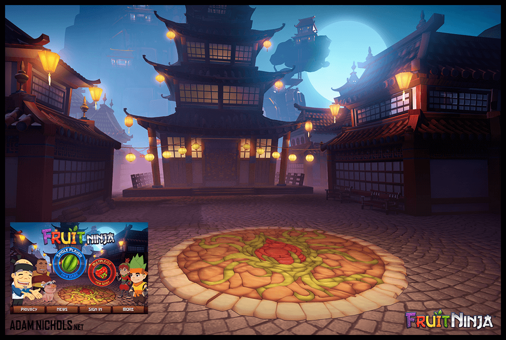
Above: Fruit Ninja - Landing Screen. This illustration was composed as a new 3D landing screen where we could introduce the new characters which were being designed for the Fruit Ninja universe. It was the first time the original game went from a flat wooden block texture to having a 3D scene.
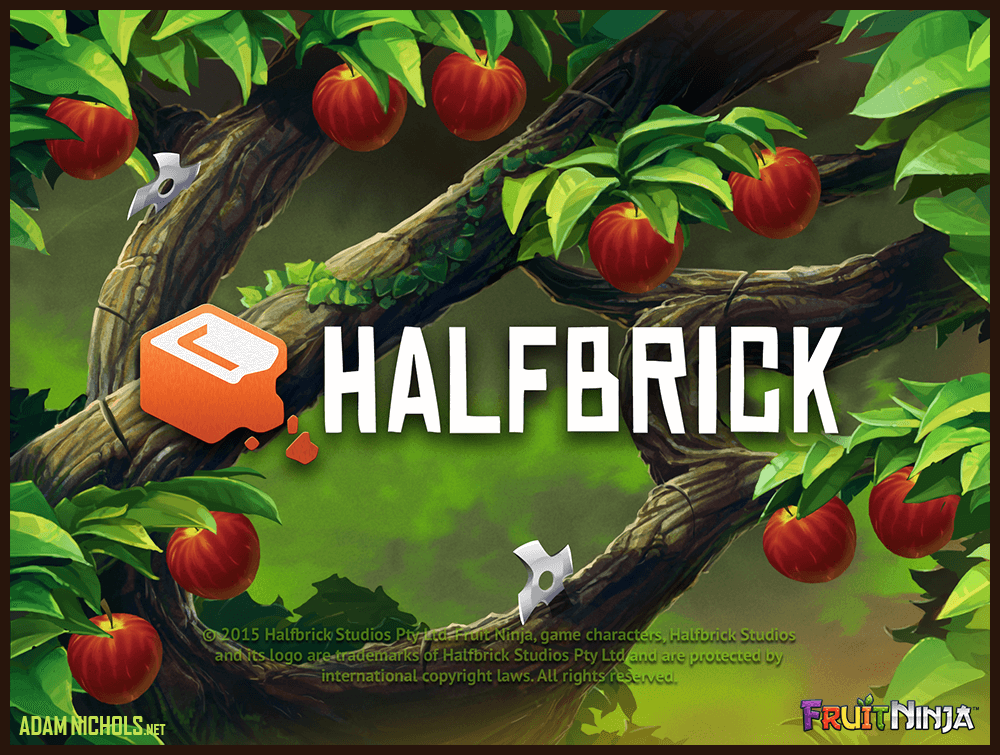
Above: Fruit Ninja - Loading Screen. Here we have an illustrated concept design for the loading screen where users could be engaged in slicing fruit while the game loaded to improve M1 (minute 1) user retention. It was but one of many split-tests our team ran using the user-centric scientific method of hypothesis validation.
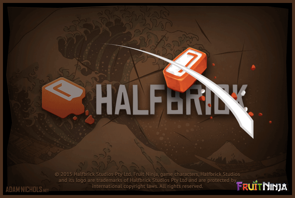
Above: Fruit Ninja - Unused Loading Screen Concept. Physics-based Brick slice mini game.
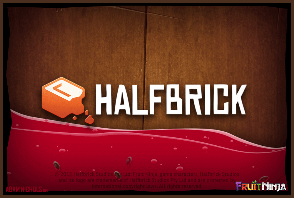
Above: Fruit Ninja - Unused Loading Screen Concept. Screen filling up with Juice.
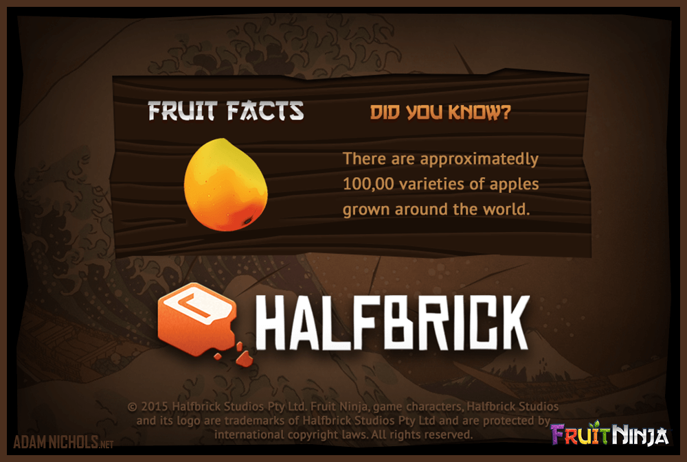
Above: Fruit Ninja - Unused Loading Screen Concept. Fruit Facts.
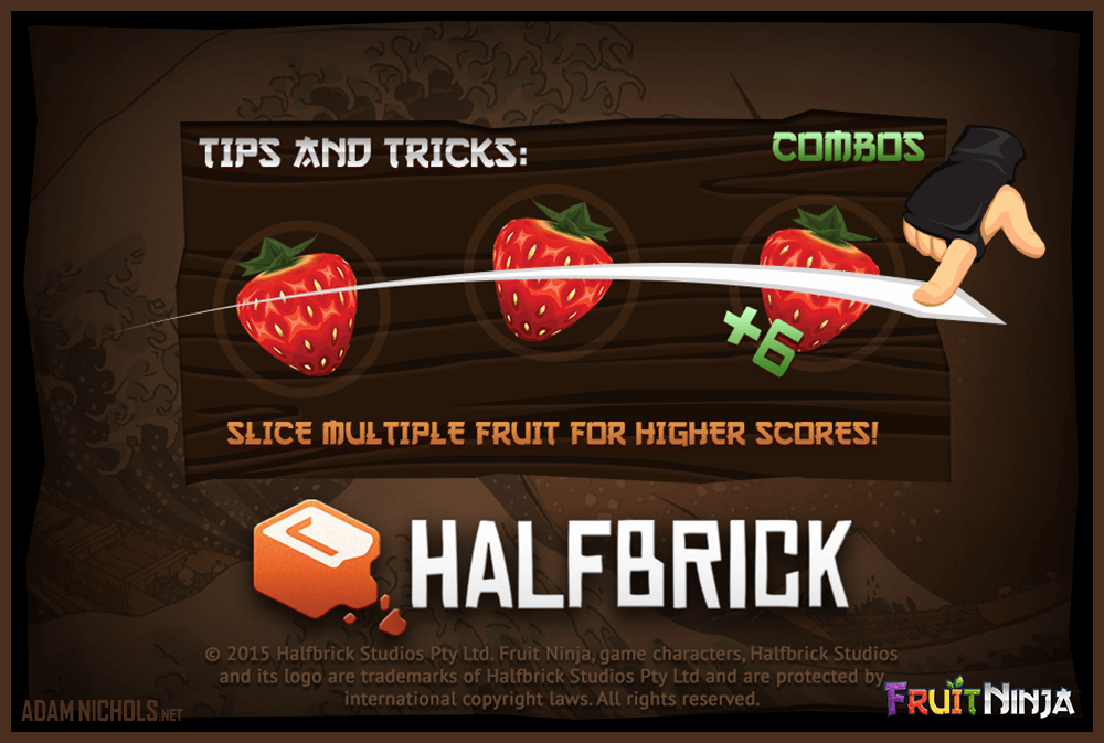
Above: Fruit Ninja - Unused Loading Screen Concept. Gameplay tutorials.
Above: Fruit Ninja - Unused Loading Screen Concept. Animated find Triffles scene.
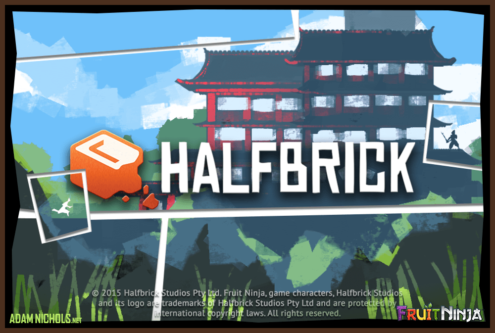
Above: Fruit Ninja - Unused Loading Screen Concept. Comic-strip style Dojo.
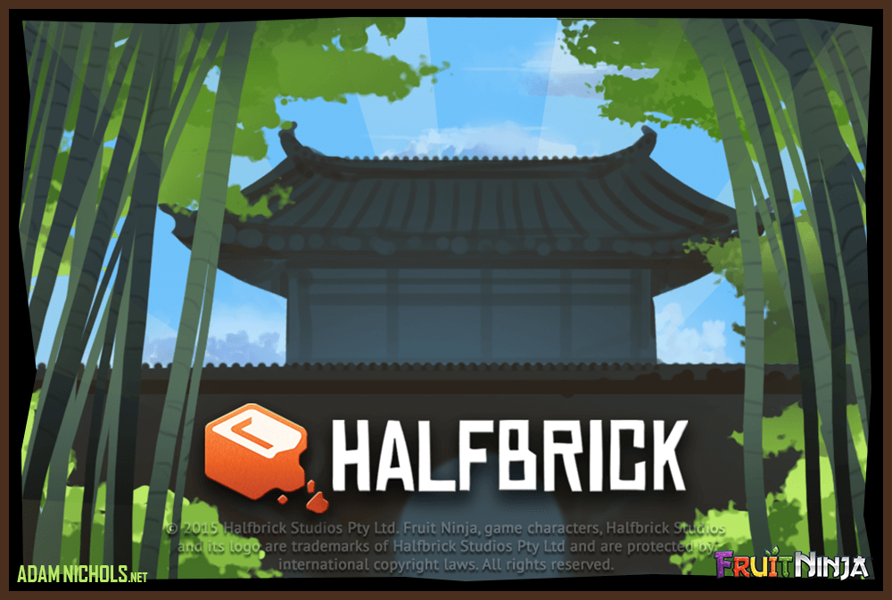
Above: Fruit Ninja - Unused Loading Screen Concept. Slow zoom Dojo with paralax depth.
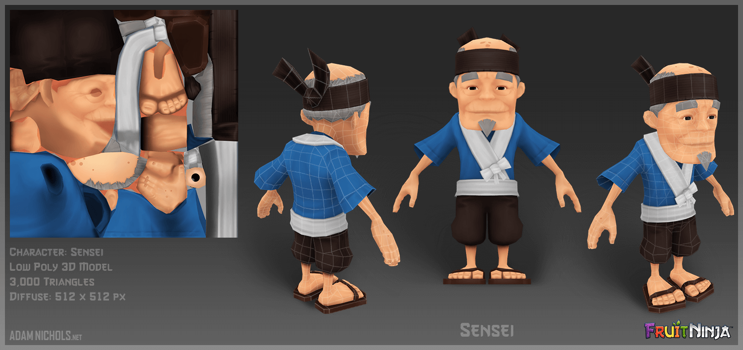
Above: Fruit Ninja - Sensei 3D Low Poly Character Asset. I don't often have time to do the 3D on many games I have worked on, however the next three characters were sadly never used in-game. Instead we went with bounce-animated flat renders in key poses for simplicity as the MVP (minimum viable product) to test our theory. It was never revisited.
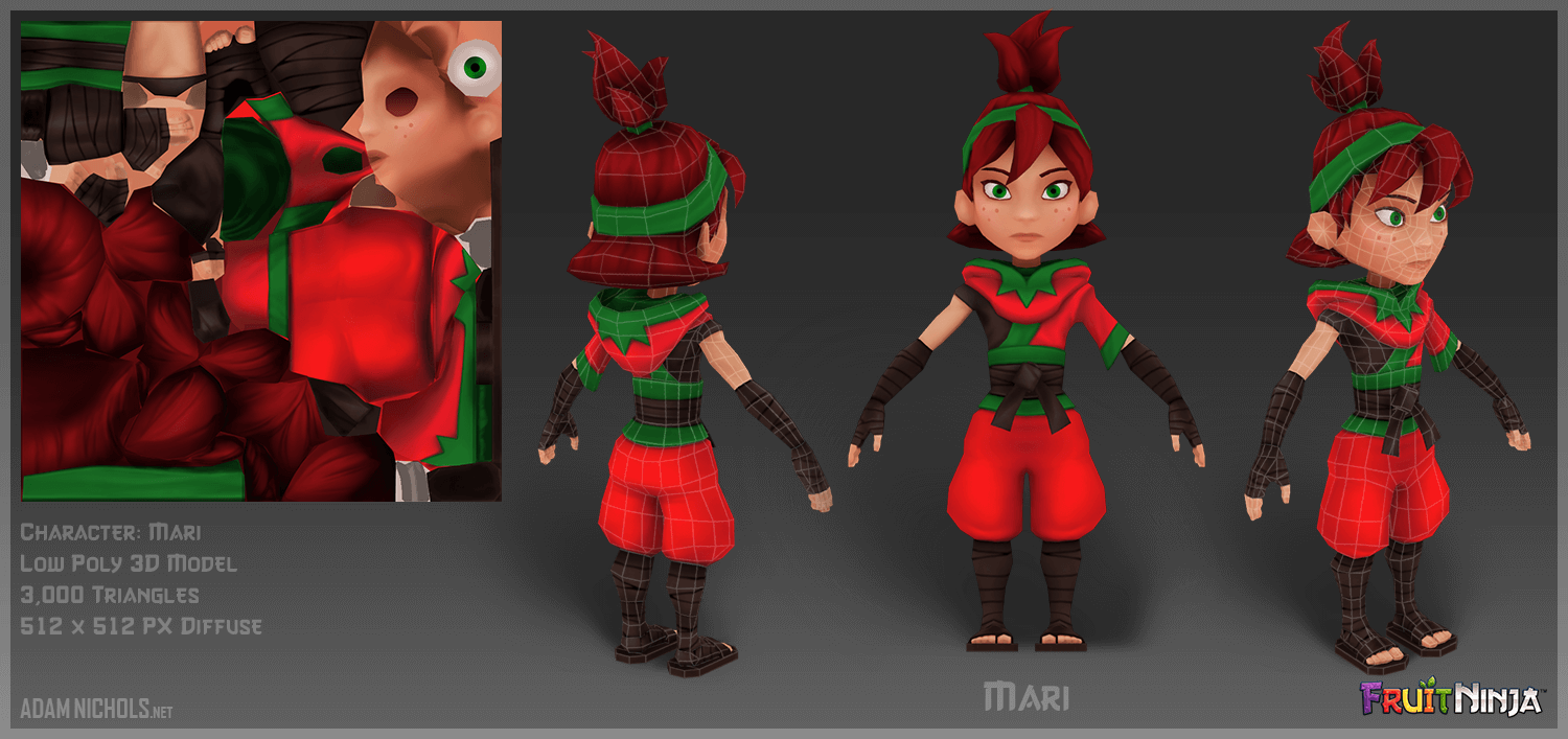
Above: Fruit Ninja - Mari 3D Low Poly Character Asset.
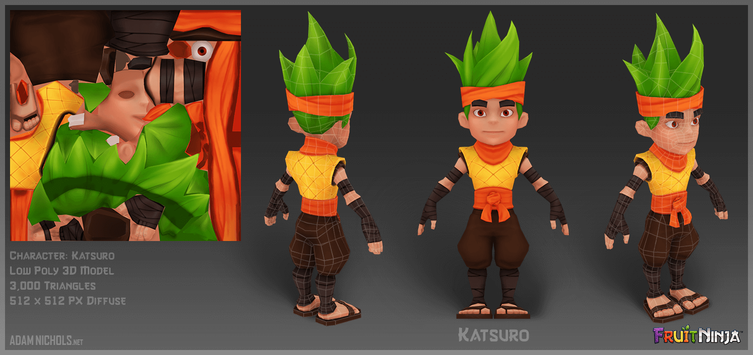
Above: Fruit Ninja - Katsuro 3D Low Poly Character Asset.
Above: Fruit Ninja - Daily XP Rewards assets icons. Many assets were modelled in 3D and exported as flat renders for maximum bang for buck. These days games would be able to handle the set of 3D assets but that was not the case when this launched.
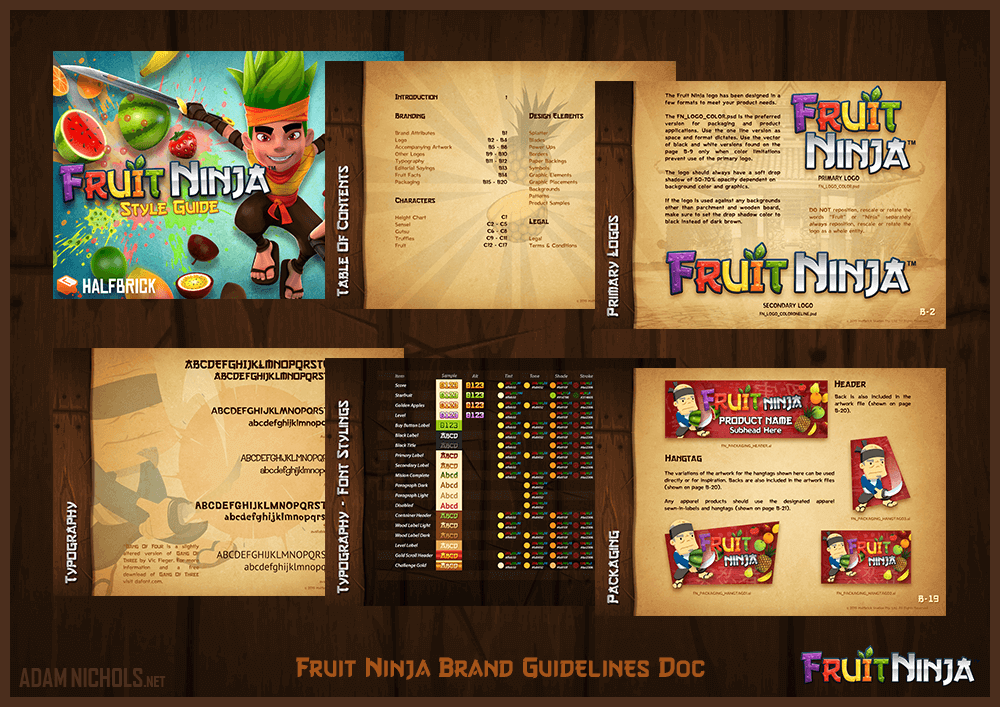
Above: Fruit Ninja - Brand Guidelines document. Once Hugh (the Art Director) left Halfbrick, I was asked to handle all official Fruit Ninja branding including the revised Brand Guidelines document which is shared with all partner companies for licensing.
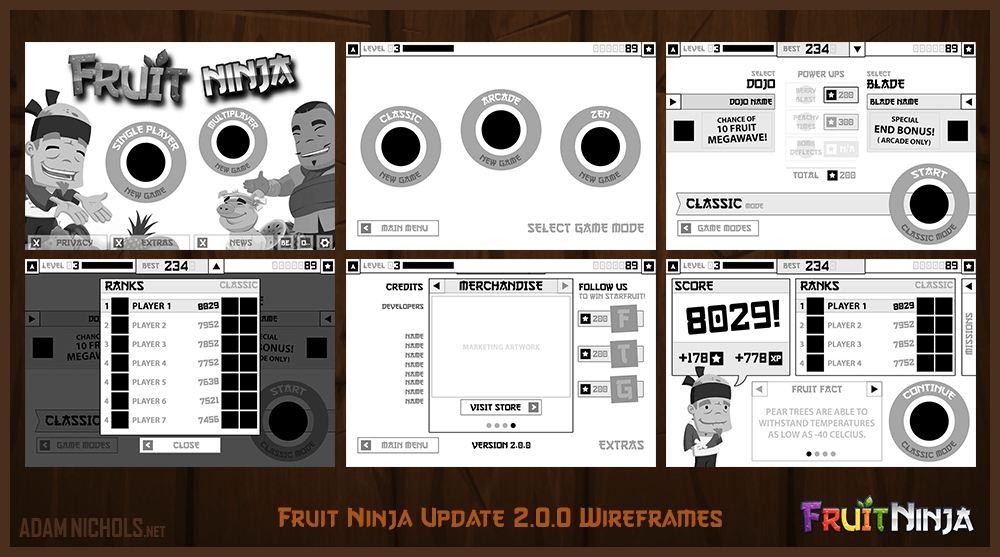
Above: Fruit Ninja - UX Design: Wireframes. Before I joined the team I was informed there had been a few aborted attempts at revamping Fruit Ninja. My approach was to suggest tackling the user experience and wireframe the entire interface before handling aesthetics (following UX before UI design industry best practices).
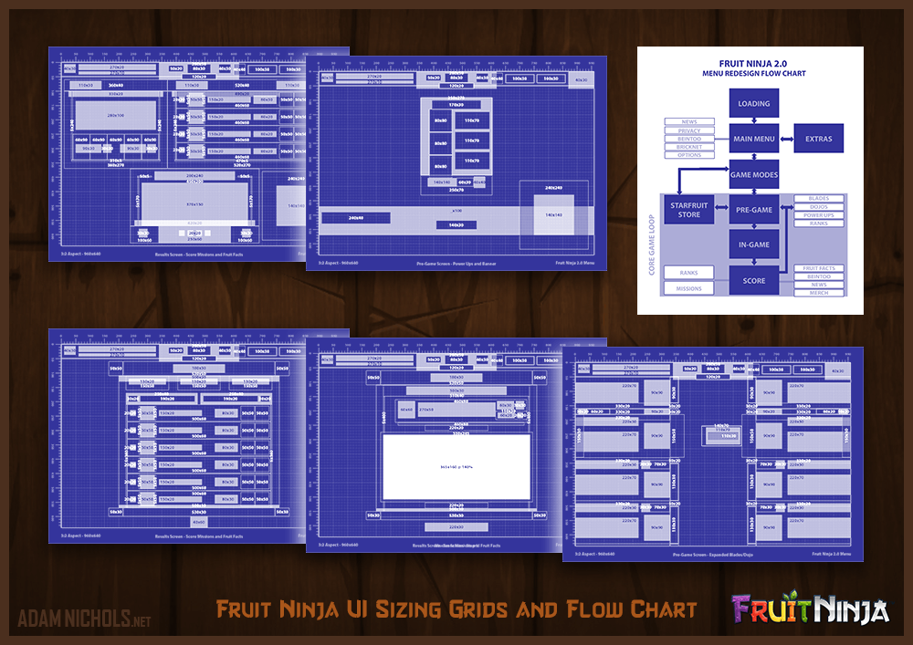
Above: Fruit Ninja - UI Design: Game Flow Chart and Sizing Grid of various screens. This basic flow chart (top right) was for the Fruit Ninja version 2.0 update. As we scaled the team size up for launch, I was tasked with assigning screens to others to build in our in-house game engine. These cut-ups were produced so that all screen designs were pixel-perfect for launch across @1, @2 and @3 retina devices.
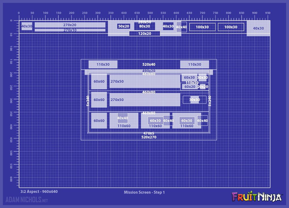
Above: Fruit Ninja - UI Design: Sizing Grid of Missions Screen. These cut-up layouts gave us quick cheat sheets for building screens much faster and more accurate, being able to discern alignment and exact pixel dimensions for all texture assets.
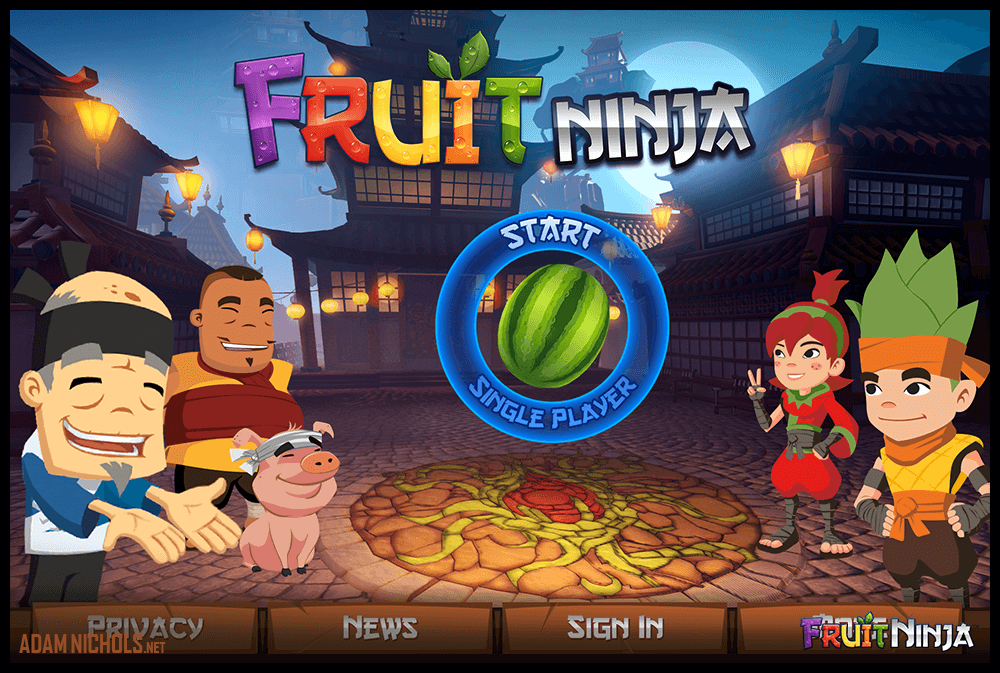
Above: Fruit Ninja - UI Design: Landing Screen.
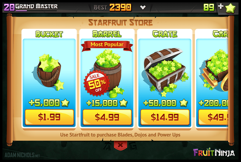
Above: Fruit Ninja - UI Design: Starfruit Store. Possibly my favourite screen design from this update. I still enjoy the bright and juicy colour palette.
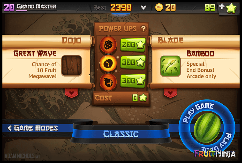
Above: Fruit Ninja - UI Design: Pre-game. Possibly the hardest screen to design. In retrospect I would do this design very differently today, but its the path already travelled. I learnt a lot on this journey.
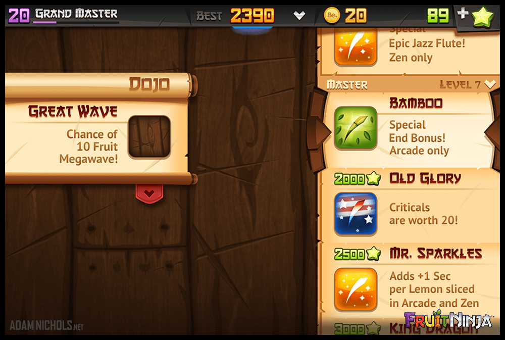
Above: Fruit Ninja - UI Design: Pre-game - Blade Select.
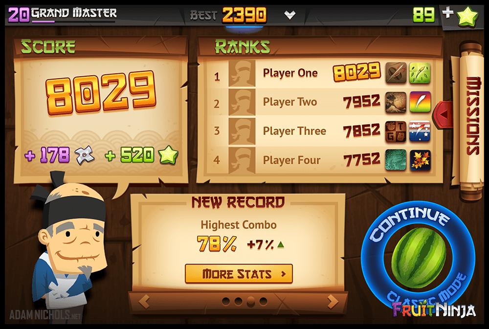
Above: Fruit Ninja - UI Design: Results.
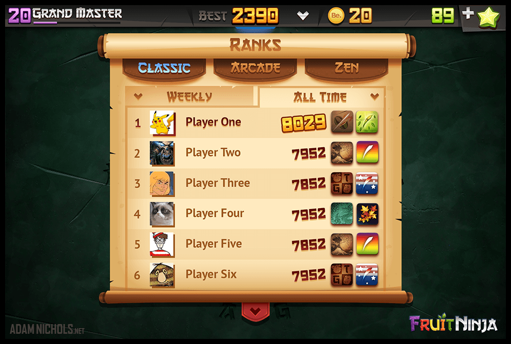
Above: Fruit Ninja - UI Design: Ranks - Classic Popup.
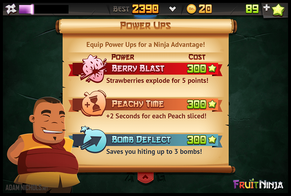
Above: Fruit Ninja - UI Design: Power Ups Popup.
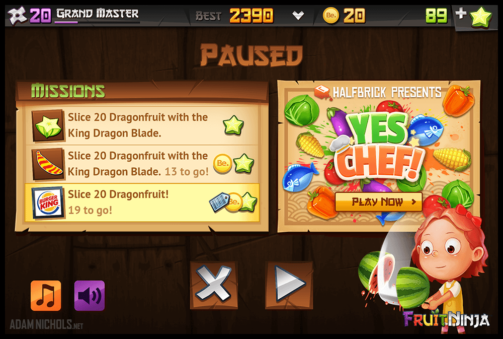
Above: Fruit Ninja - UI Design: Pause Menu.We did explore in-game ads on the pause screen. Not a personal fan of this approach but cross-promotion was being tested throughout the entire company at the time.
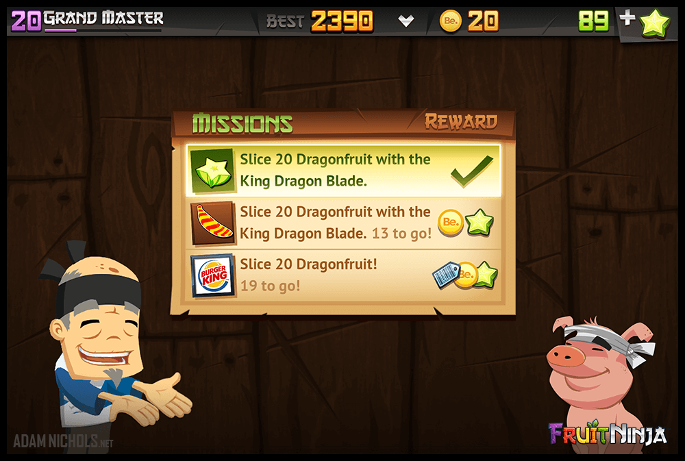
Above: Fruit Ninja - UI Design: Missions Popup.
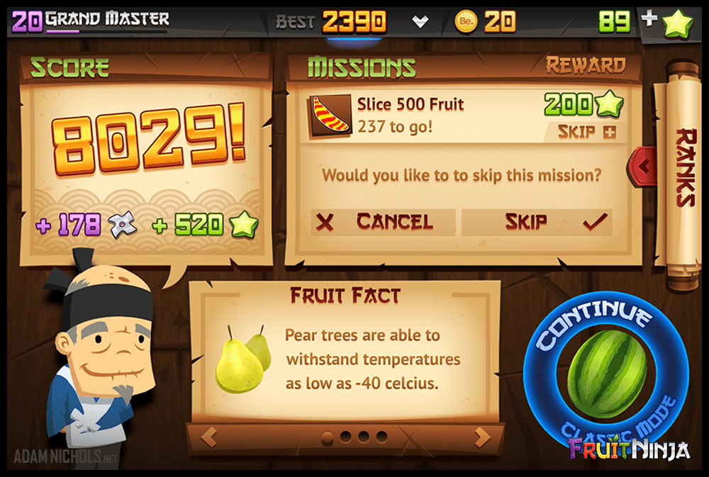
Above: Fruit Ninja - UI Design: Results - Missions Skip.
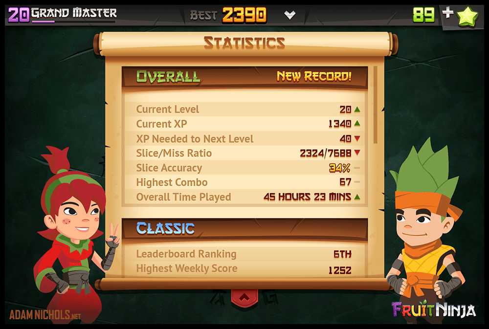
Above: Fruit Ninja - UI Design: Statistics (split test).
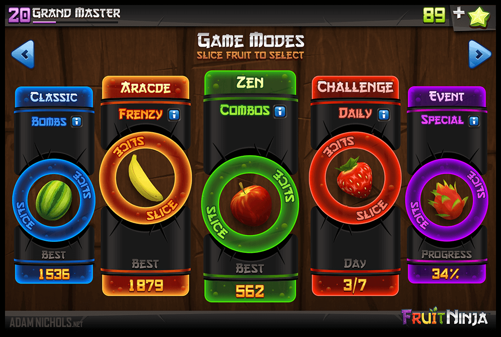
Above: Fruit Ninja - UI Design: Game Modes Select (split-test).
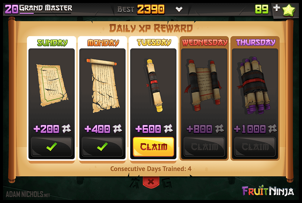
Above: Fruit Ninja - UI Design: Daily XP Rewards (split-test).
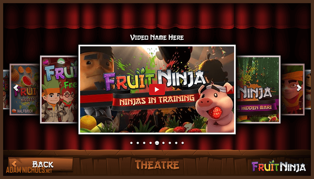
Above: Fruit Ninja - UI Design: In-game YouTube Theatre (split-test).
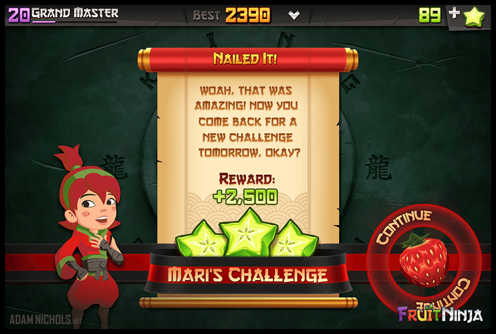
Above: Fruit Ninja - UI Design: Mari's Daily Challenge (split-test).
Well that is all I have to show for now from the massive Fruit Ninja version 2.0 update. Be aware there is also galleries for the official Ghostbusters Fruit Ninja cross-over event, as well as the even bigger Fruit Ninja 5th anniversary update where we hit 1 billion (yes billion with a b) downloads, and Fruit Ninja 2 projects. Check them out along with many other projects in my art gallery section.
Copyright © 2005-2025 Adam Nichols. All Rights Reserved.